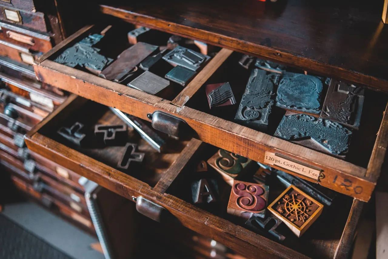
The Risograph was never meant to be beautiful. It was built in the 1980s as an office workhorse, a fast and cheap way to churn out church newsletters and school handouts. By every measure of fidelity it is worse than a modern inkjet: the registration drifts, the inks smudge if you breathe on them, and you can only print one colour at a time. So why are art-school studios and independent publishers paying serious money to keep these machines alive?
Beautiful imperfection
The answer is the very unreliability that doomed it as office equipment. Riso ink is soy-based and slightly translucent, so when two colours overlap they mix in ways you cannot fully predict. The slight misregistration that an engineer would call a defect reads, to an artist, as warmth and movement. Every print is a little different from the last. In a culture drowning in identical files, that variation feels almost radical.
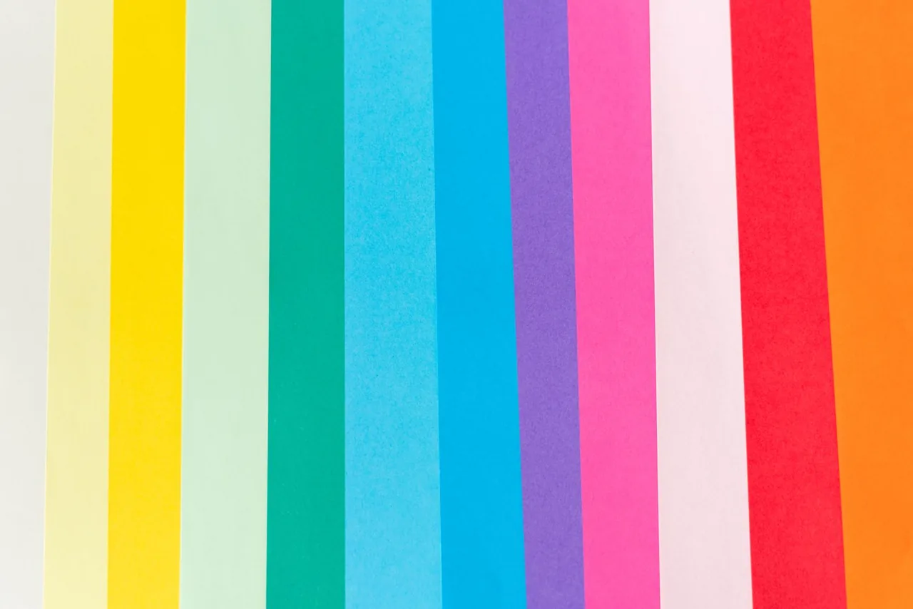
There is also the colour itself. Riso fluorescent pink and bright blue have a glow no CMYK process can match, because they are spot inks rather than dots of process colour. Designers who grew up on flawless screen gradients are often startled the first time they see a Riso print catch the light.
A community, not just a machine
Part of the revival is social. Riso printing is hands-on and forgiving of experiment, which makes it ideal for zine fairs, small-press collectives and shared studios. People gather around the machine, troubleshoot drum changes together and trade tips on layering. The technology is almost beside the point; the culture around it is the real product.
Whether the Riso boom lasts another decade is anyone's guess. But its survival is a useful reminder that progress in print is not a straight line from worse to better. Sometimes a tool dies as a commodity and is reborn as an instrument — and the people who keep it running are not nostalgists, but artists who have found something the cleaner tools cannot give them.