A generation of designers has learned colour entirely through screens — bright, backlit, forgiving displays where almost anything looks vivid. Then they send their first job to print and get a nasty surprise. The luminous blue on the monitor arrives as a flat, sulky navy. The neon green dies. The rich black turns muddy grey. The problem is not the printer; it is that screen colour and print colour are fundamentally different beasts.
Light you add versus light you take away
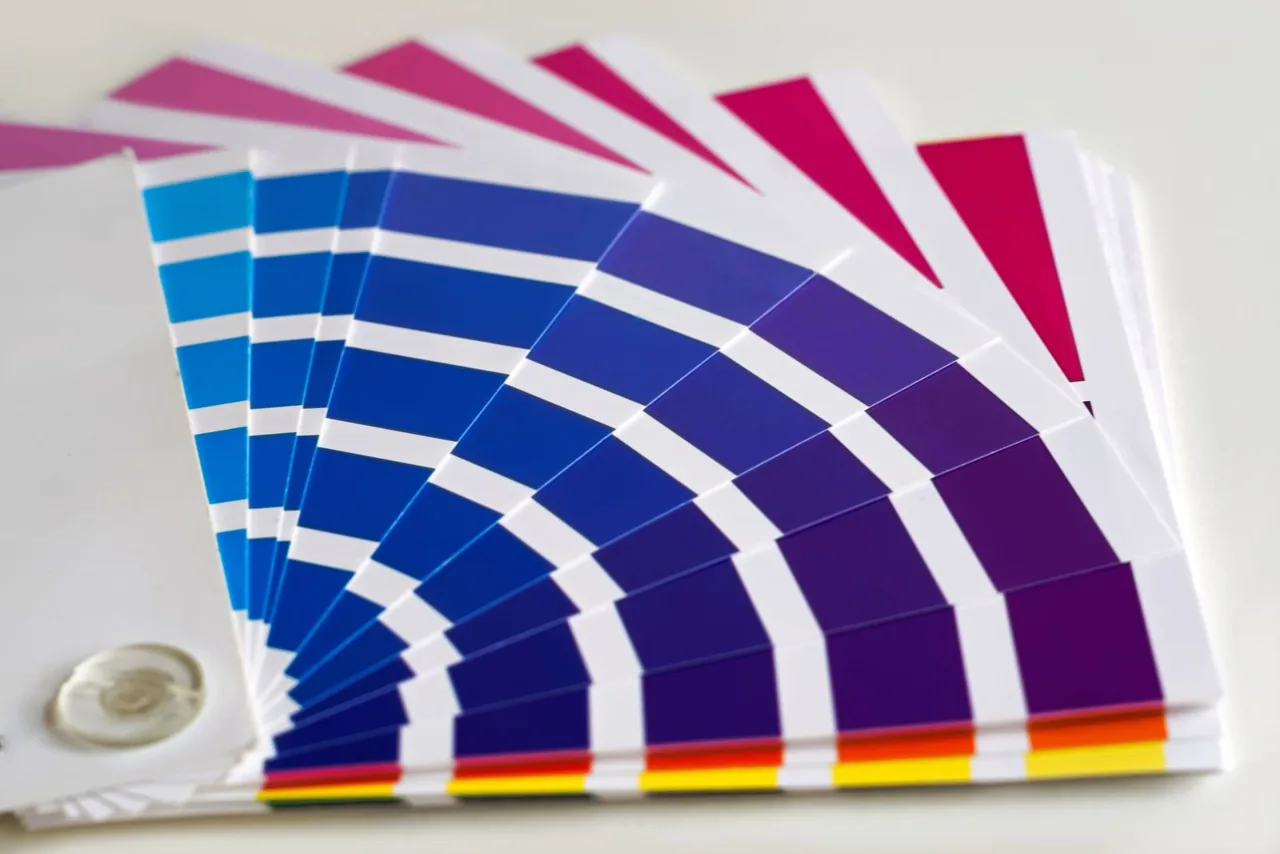
Screens make colour by adding light — red, green and blue beams combining toward white. Print does the opposite. It lays down inks that subtract light, absorbing some wavelengths and reflecting the rest back to your eye. That is why the colour models differ: RGB for the additive world of screens, CMYK for the subtractive world of ink on paper. Colours that are easy for one are often impossible for the other.
The practical consequence is a smaller playground. The range of colours print can reproduce — its gamut — is narrower than a screen's, especially at the bright, saturated end. The glowing cyan that looks electric on a display has no ink equivalent. Designers who plan for print from the start, rather than converting at the last minute, avoid the heartbreak of watching their palette collapse.
Designing with the medium, not against it
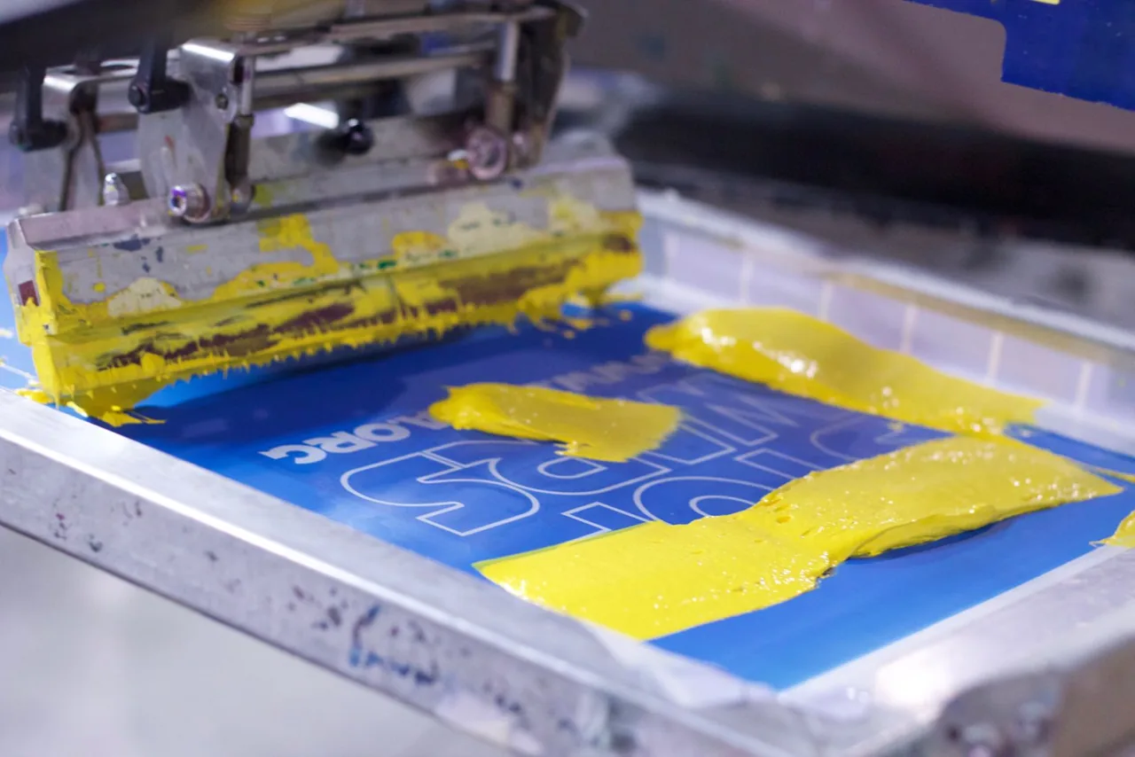
Smart print designers lean into what ink does well. Rich, deep, slightly imperfect colour. The way a spot ink can hit a precise hue that process printing only approximates. The texture of ink sitting on a particular paper stock, which changes the colour again depending on whether the sheet is coated or uncoated, warm or cool.
Colour on paper is a physical event, not a setting in a panel. The designers who make peace with that — who learn what their inks and stocks can actually do — produce work that looks intentional rather than disappointed. The screen lies to you a little. Print never does.