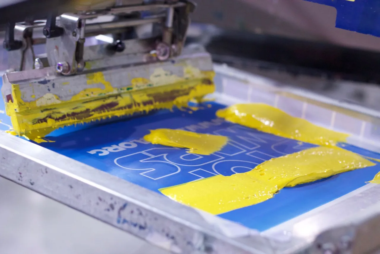
Ask a beginner what makes a layout work and they will point at the things you can see: the headline, the photograph, the bold splash of colour. Ask a working designer the same question and they will more often point at the parts you cannot — the breathing room around an image, the gap between a caption and the column it serves, the margin that lets a page exhale. Negative space is the quiet half of every composition, and it does more heavy lifting than most people ever notice.
Space as a deliberate decision
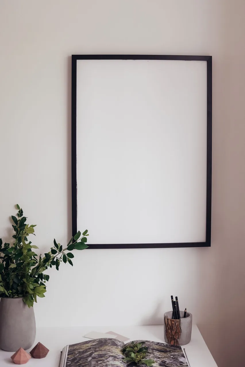
The mistake amateurs make is treating empty areas as leftovers, something to fill once the real work is done. Seasoned practitioners flip that logic entirely. They place the void first and let the content earn its place inside it. A poster with one small word in an ocean of paper reads as confident. The same word crammed against a busy border reads as nervous. Nothing about the typeface changed; only the air around it did.
There is a practical reason this matters beyond taste. The eye needs somewhere to rest. A layout with no relief fatigues a reader within seconds, and a fatigued reader stops reading. Margins, line spacing and the pauses between elements are not decoration. They are the pacing of the page, the equivalent of punctuation in a sentence.
Learning to see the gaps
One exercise we recommend to younger designers is to squint at a finished spread until the words blur into grey blocks. What remains is the architecture: the shapes of the spaces themselves. If those shapes feel awkward, lopsided or cramped, no amount of clever typography will save the piece. If they feel balanced and intentional, the design is already most of the way home.
Negative space is generous. It tells the reader you are not trying to sell them every square millimetre. In a world of cluttered feeds and shouting interfaces, restraint has become its own form of luxury — and the designers who understand that are the ones whose work still looks calm a decade later.