The graphic tee is one of the most democratic objects in visual culture. It costs little, travels everywhere and turns the wearer into a walking exhibition. But the very things that make it accessible also make it deceptively hard to design. A poster hangs still on a wall; a shirt moves, folds, stretches and is seen from across a room before anyone reads a word. Designing for that canvas demands a different set of instincts.
Read at a glance, reward up close
The best tee designs work on two levels. From a distance they resolve into a single clear shape or idea — a silhouette, a bold mark, a punchy phrase. Up close they offer a second layer: a clever detail, a joke that lands on the second read, a texture you only notice when you are near. A design that only works at one distance feels flat. One that rewards both the glance and the lingering look earns its place in someone's rotation.
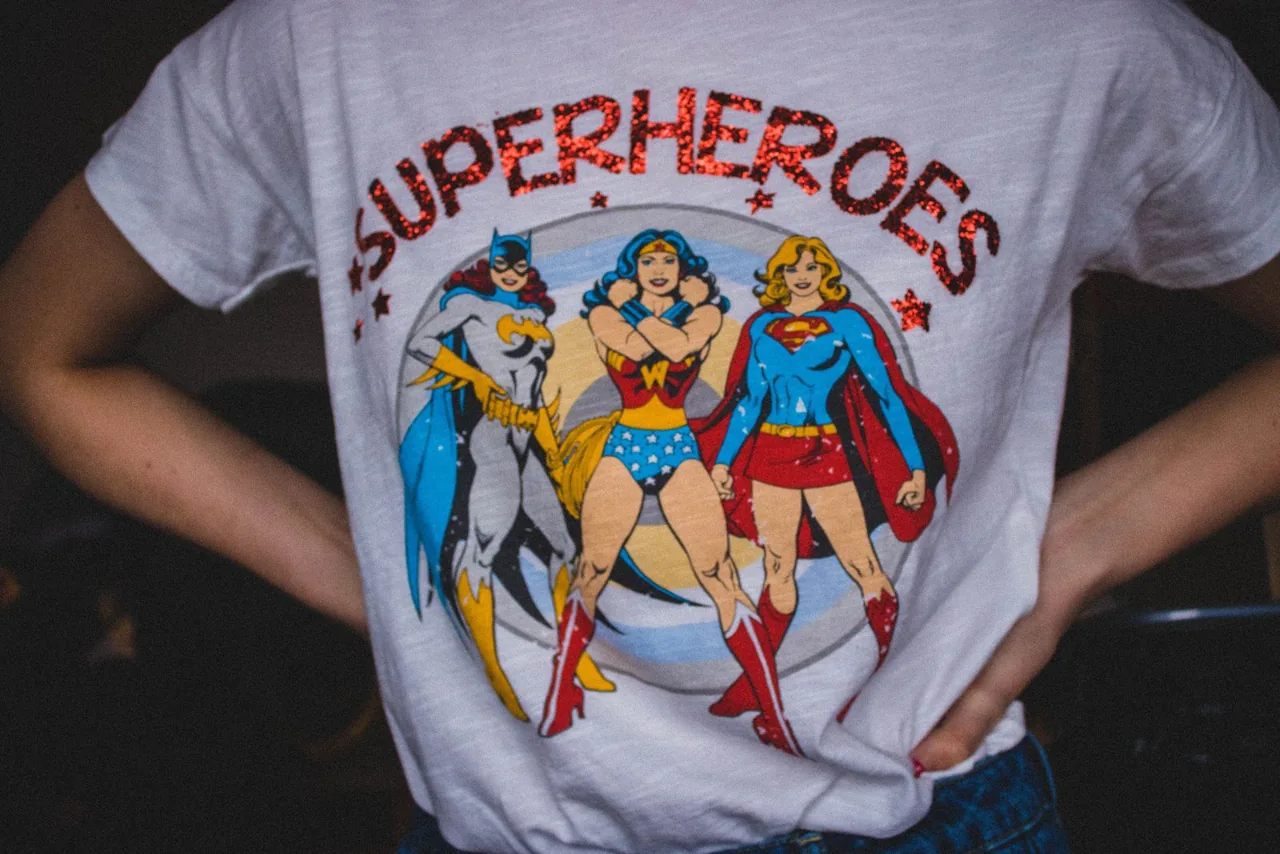
Subculture tees understand this better than most. Look at how the strongest geek t-shirt designs handle an inside joke: the surface reads as a confident graphic to a stranger, while the punchline lands instantly for anyone in the know. That double life — universal at a glance, specific up close — is the whole craft in miniature, and it is far harder to pull off than slapping a slogan across the chest.
Designing for fabric, not paper
Then there are the constraints of the medium. Thin lines clog or crack. Huge flat areas of ink feel stiff and heavy to wear. Colours shift against a coloured shirt in ways they never would on white paper. A designer who ignores these realities ends up with artwork that looked great on screen and miserable on cotton.
Get all of it right and the payoff is rare in design: people choose to display your work on their own bodies, for free, for years. No billboard buys that kind of loyalty. The humble graphic tee, done properly, is one of the most demanding briefs in the business — and one of the most rewarding.